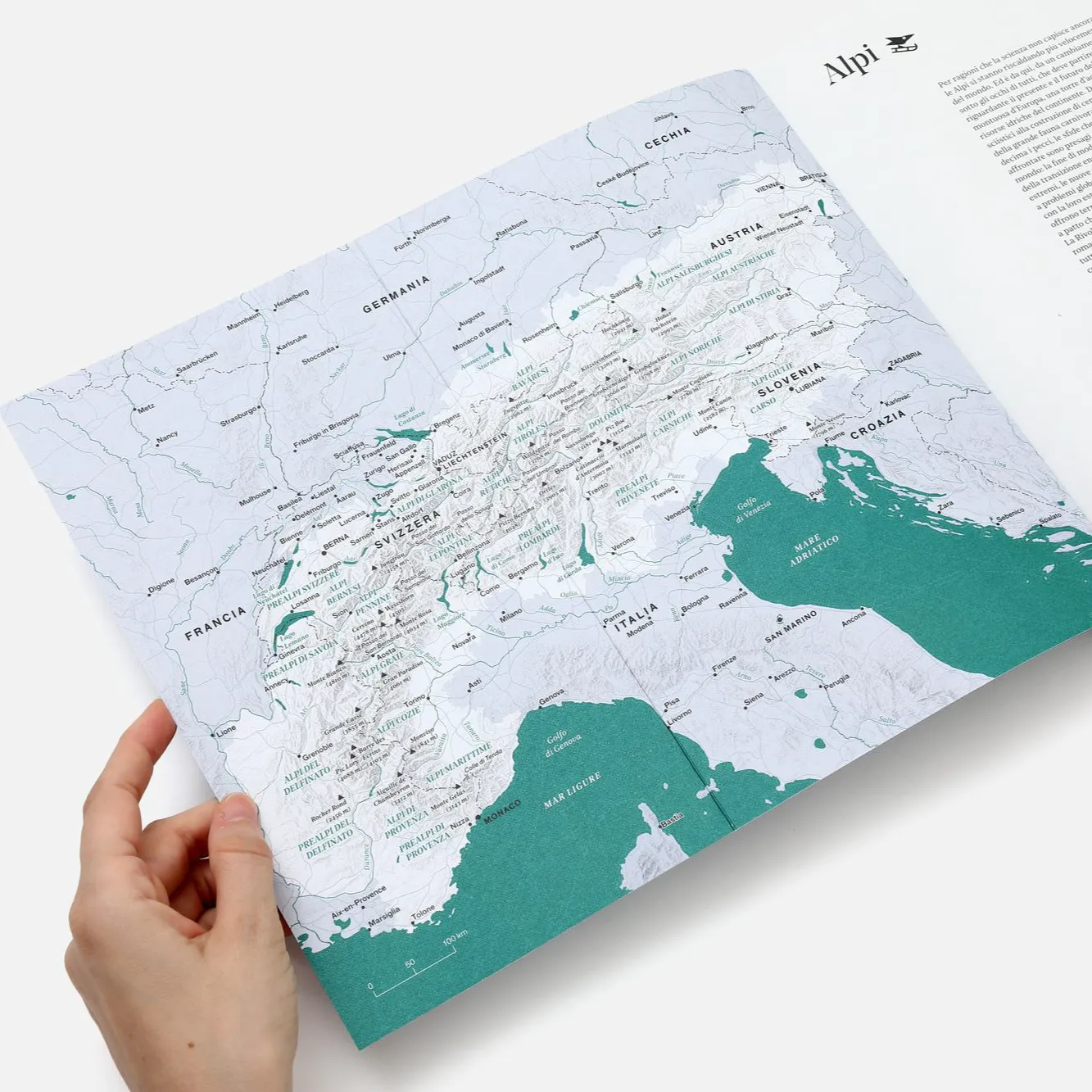
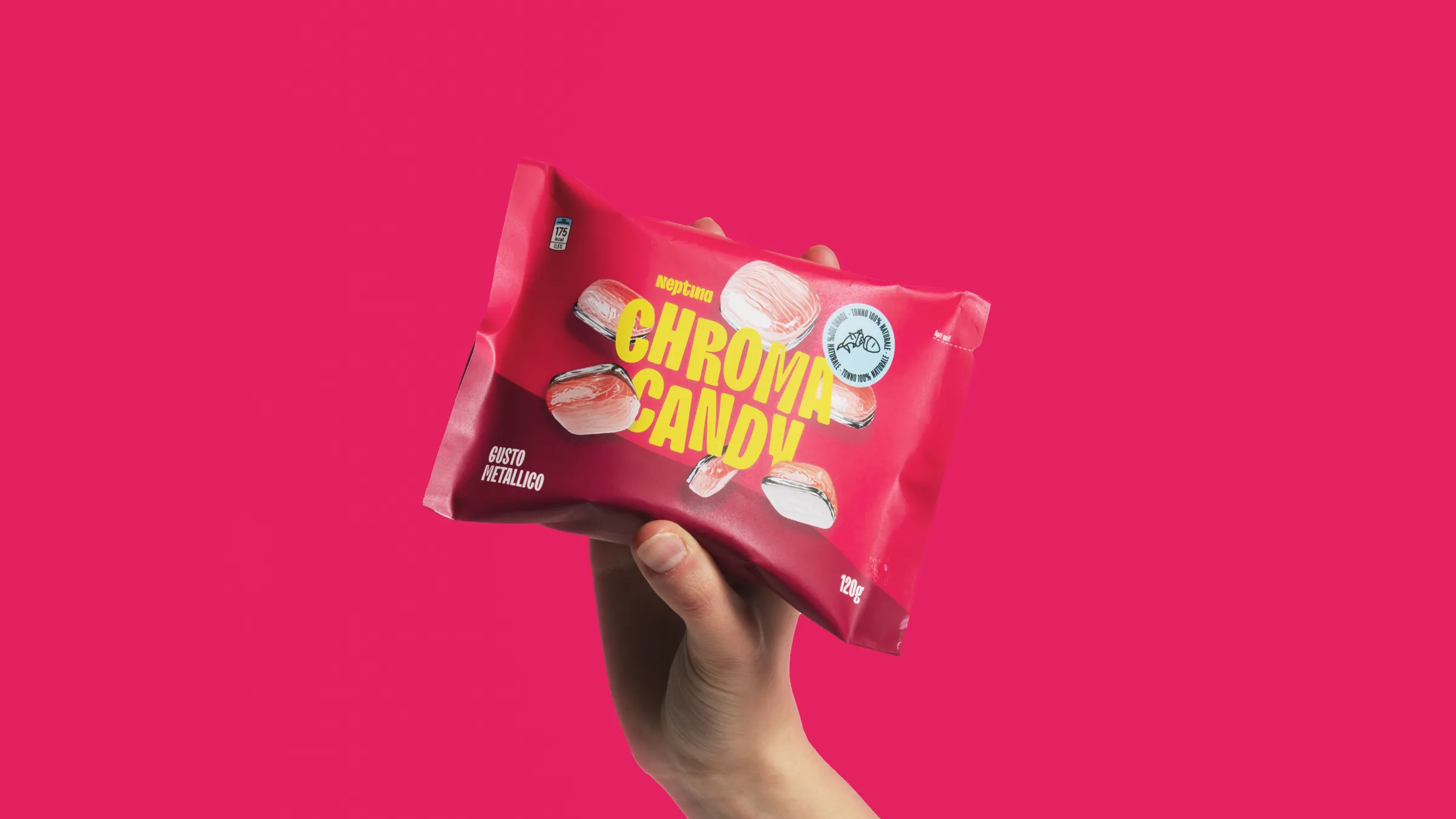
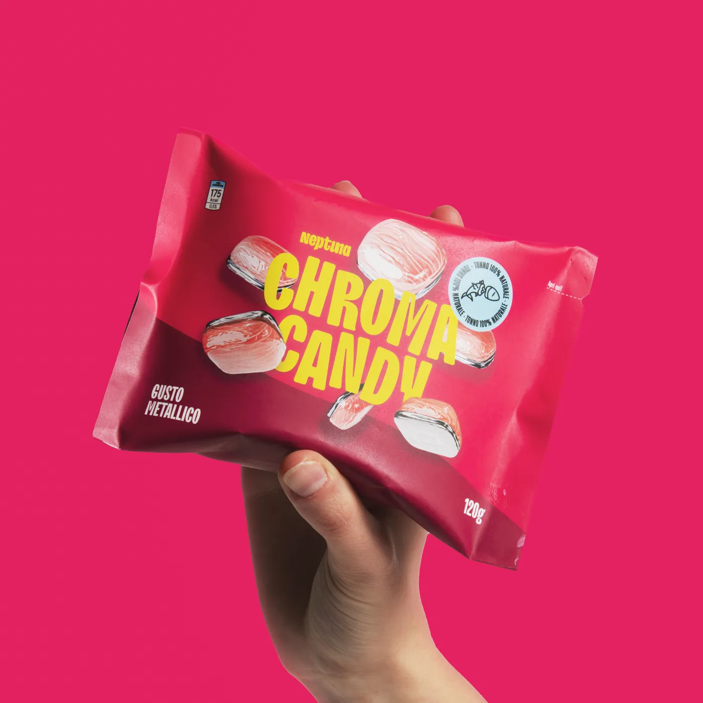
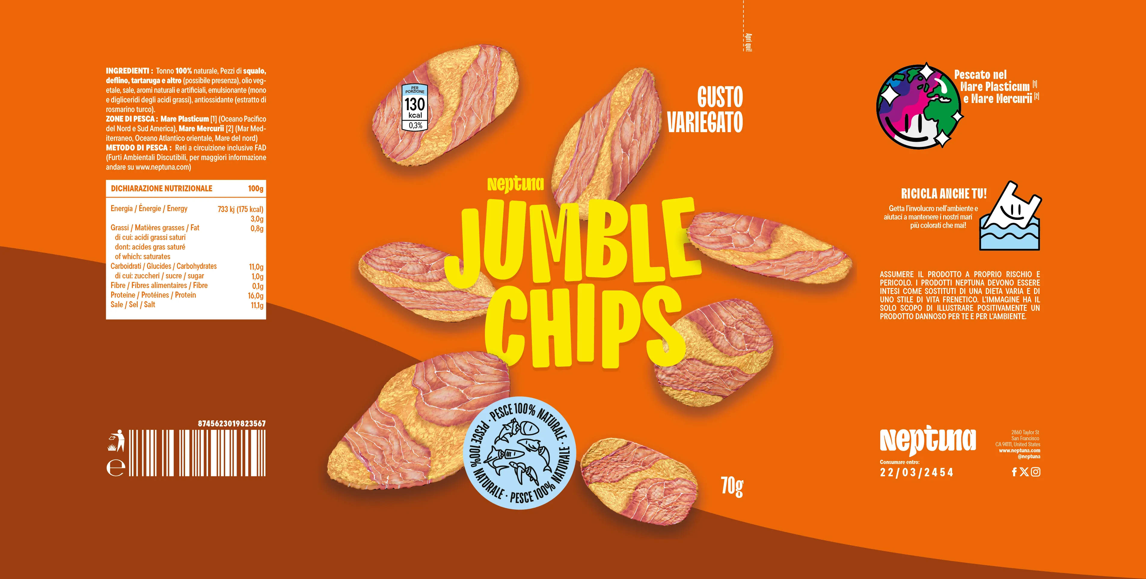
Cookies

This website uses cookies and similar technologies to ensure proper functionality, analyze traffic, and improve your experience. By continuing to browse, you consent to the use of these technologies. You can manage your preferences or withdraw your consent at any time through your browser settings.

Close

Visual and digital system designer and researcher, intersecting a human centered approach and new technologies from Munich based in Milan.


Work spans across identities, interfaces, and communication systems, operating between research, strategy, and design. Projects are shaped through careful analysis and clear structuring, with an emphasis on coherence, precision, and long term cultural relevance.

Services

Brand strategy/positioning

Brand visual identity

Creative direction

Graphic design

UI/UX design

Front-end development

Type design

Information design

Wayfinding

Cartography

Motion design

Full curriculum on request

Cookies

This website uses cookies and similar technologies to ensure proper functionality, analyze traffic, and improve your experience. By continuing to browse, you consent to the use of these technologies. You can manage your preferences or withdraw your consent at any time through your browser settings.

Close

Visual and digital system designer and researcher, intersecting a human centered approach and new technologies from Munich based in Milan.


Work spans across identities, interfaces, and communication systems, operating between research, strategy, and design. Projects are shaped through careful analysis and clear structuring, with an emphasis on coherence, precision, and long term cultural relevance.

Services

Brand strategy

Visual identity

Creative direction

Graphic design

UI/UX design

Front-end development

Type design

Information design

Wayfinding

Map design

Motion design

Editorial design

Full curriculm on request

Image 4
Image 5
Image 6

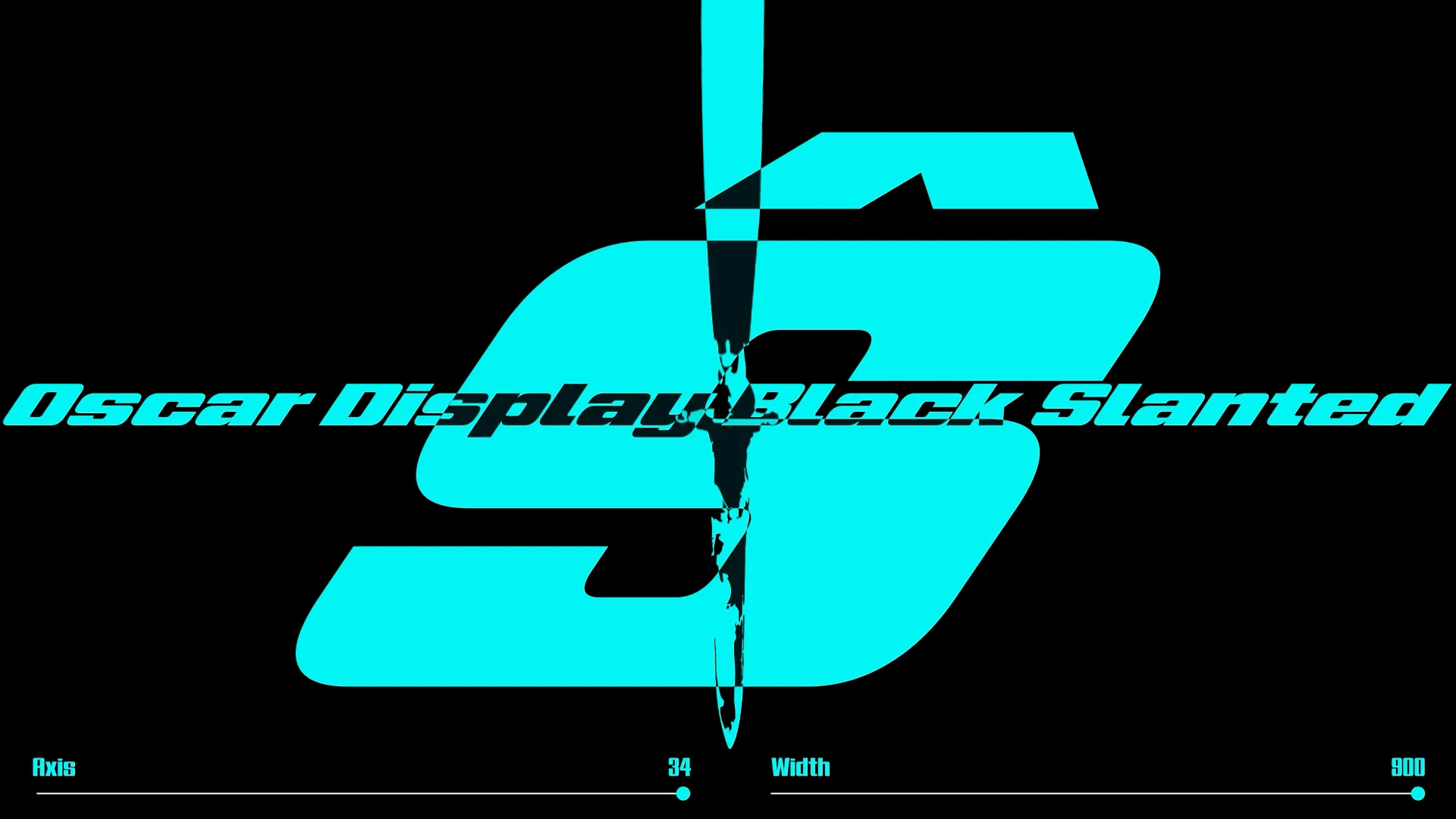
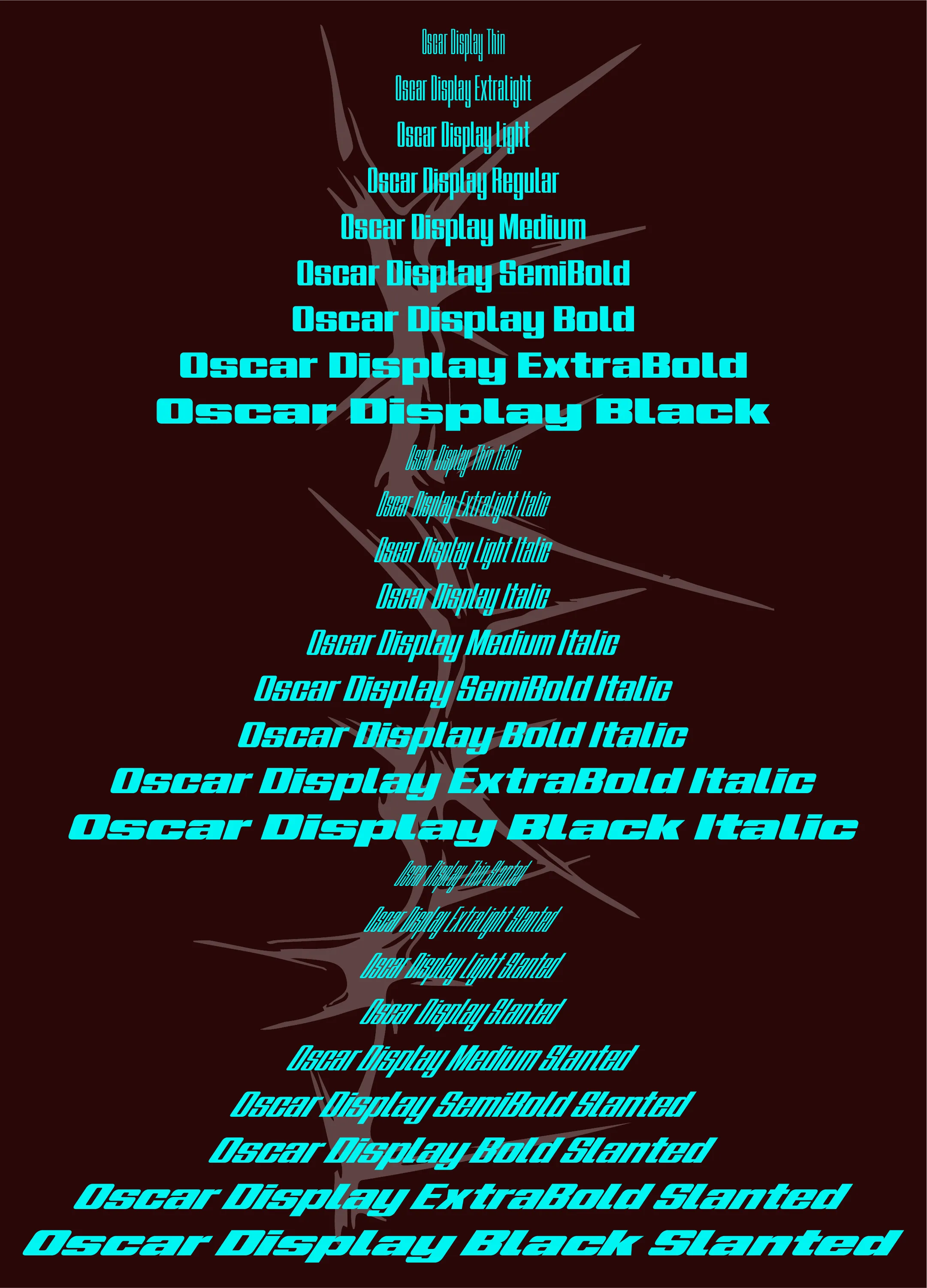
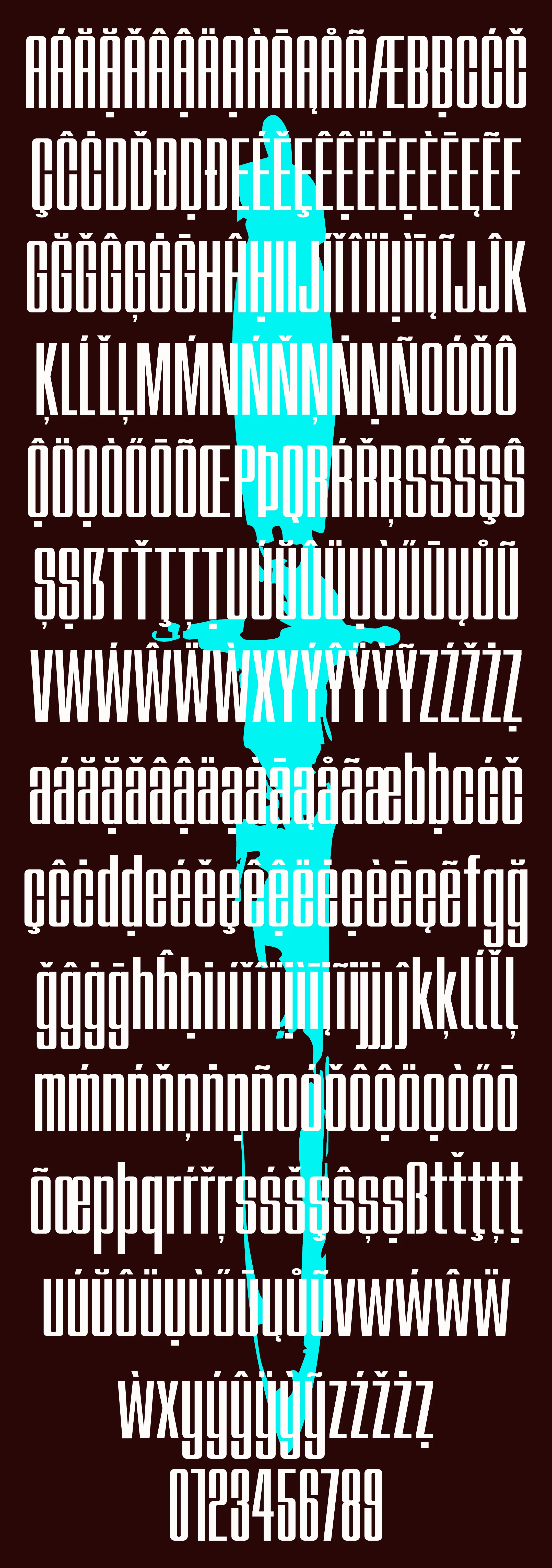
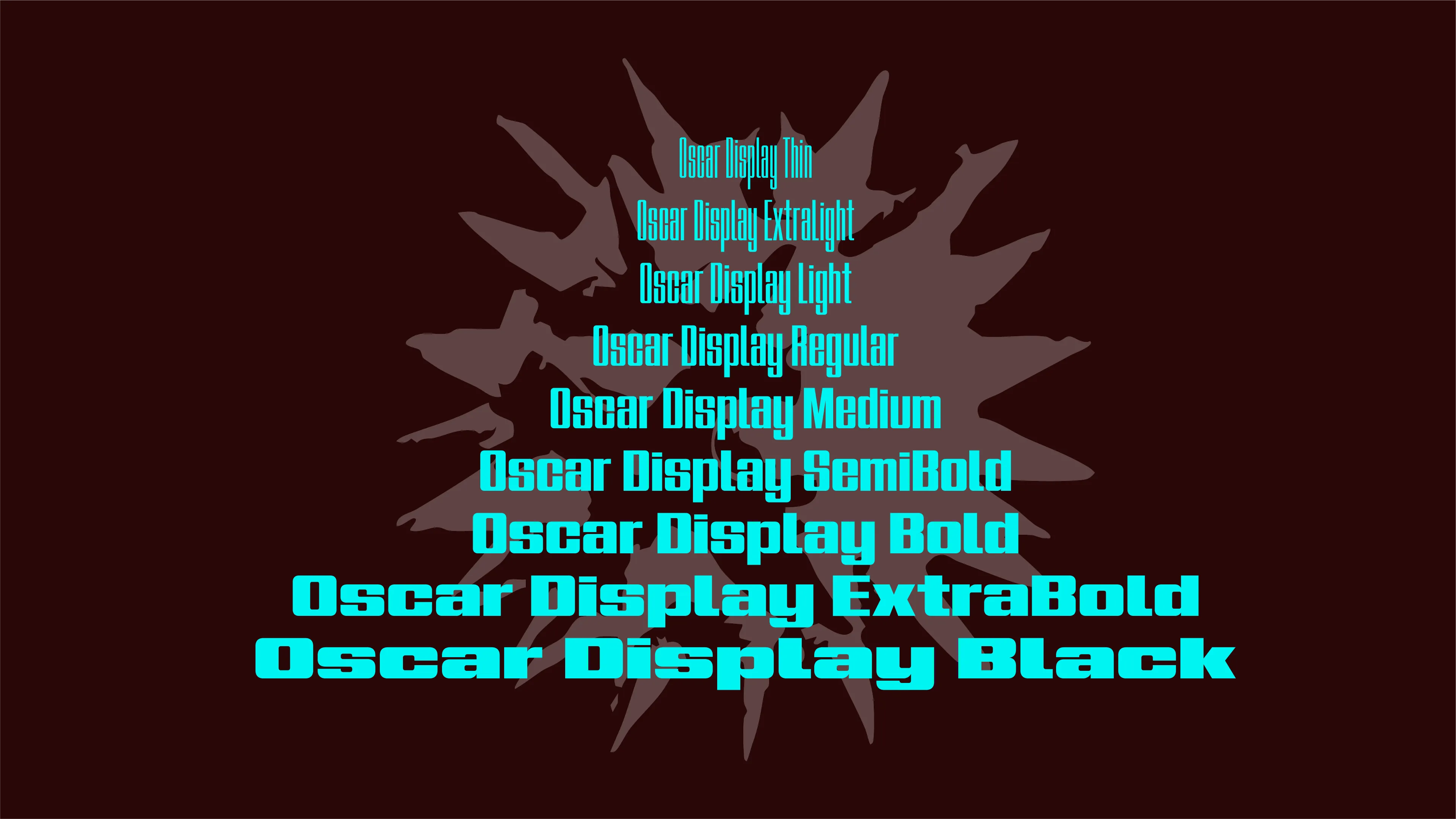
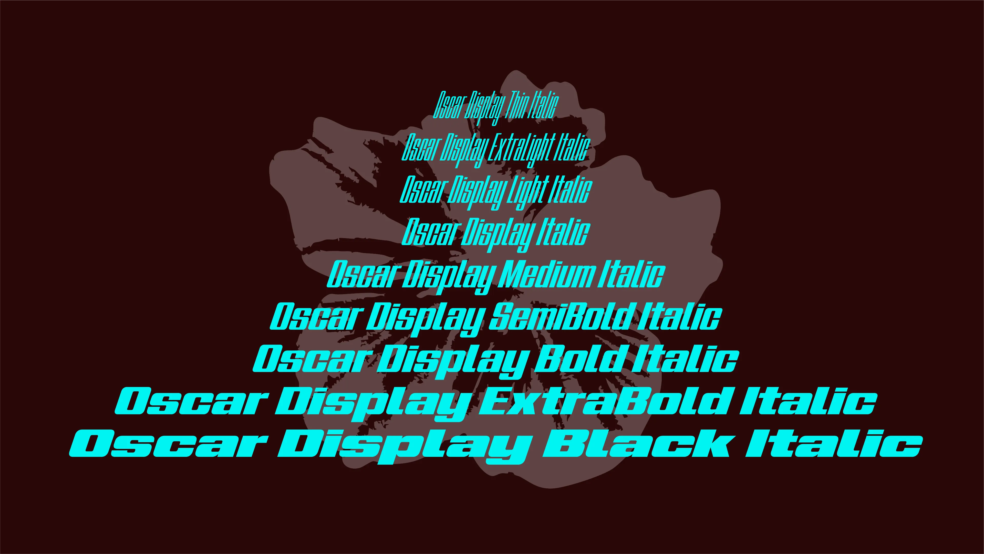
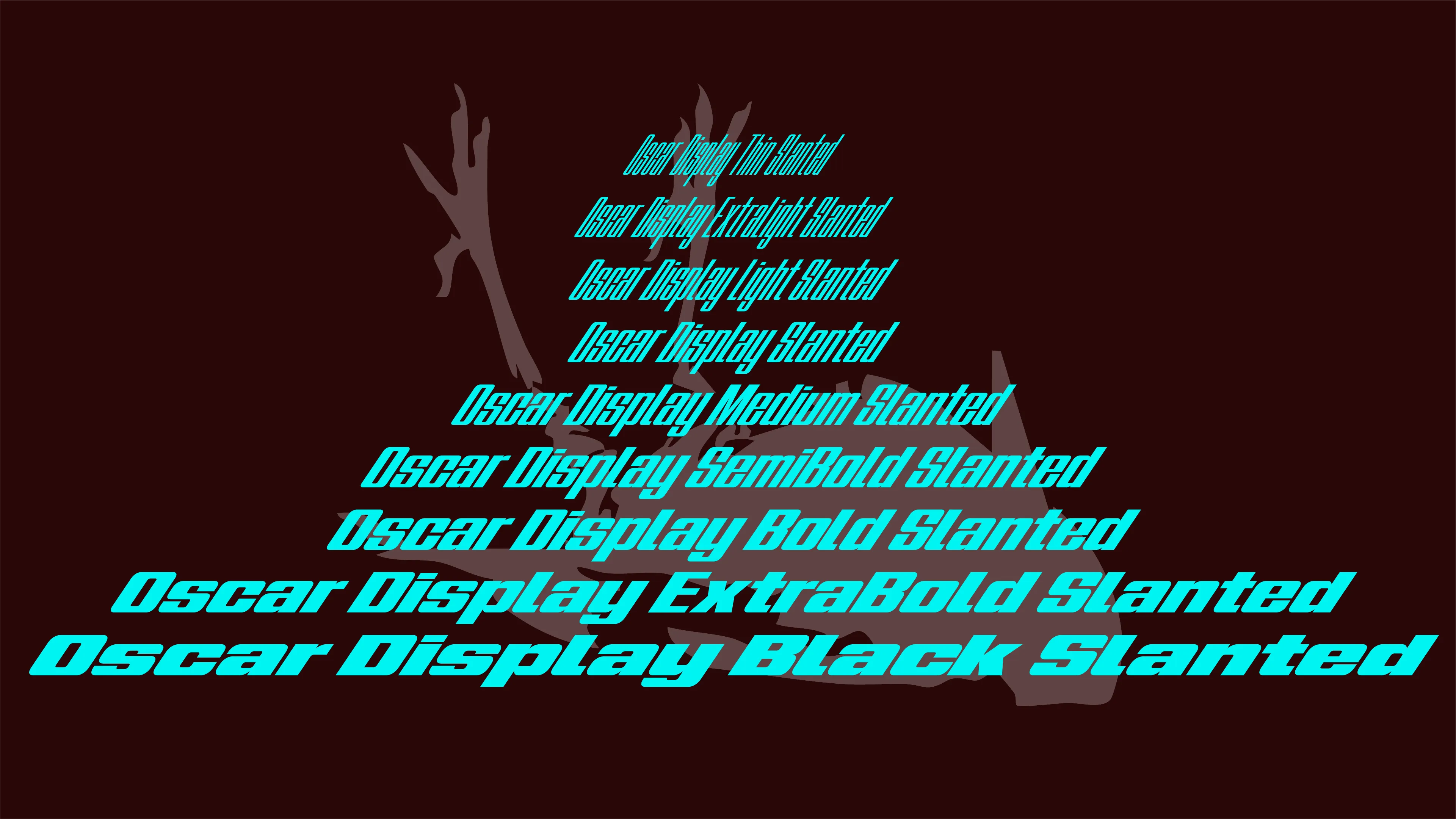
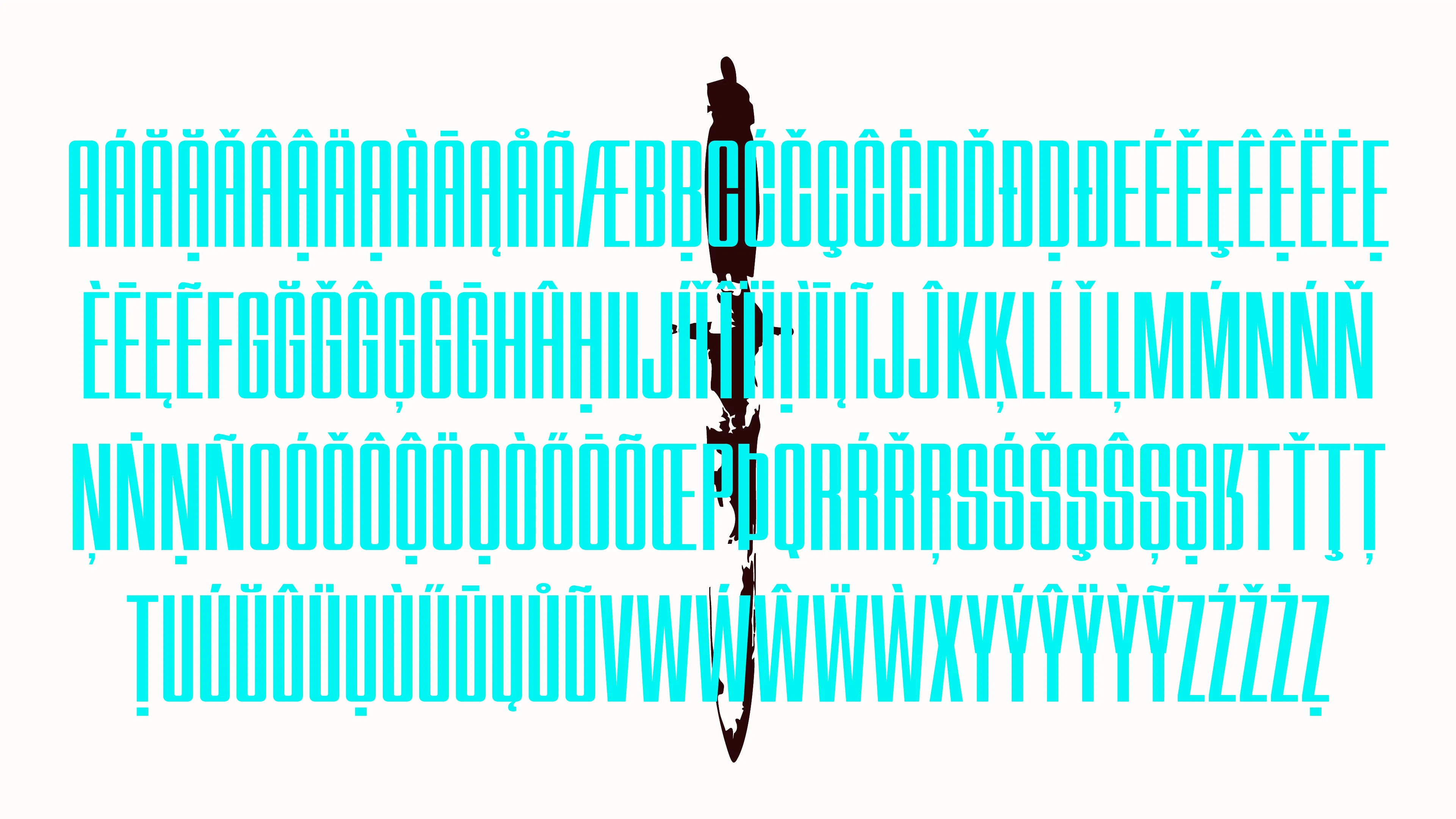
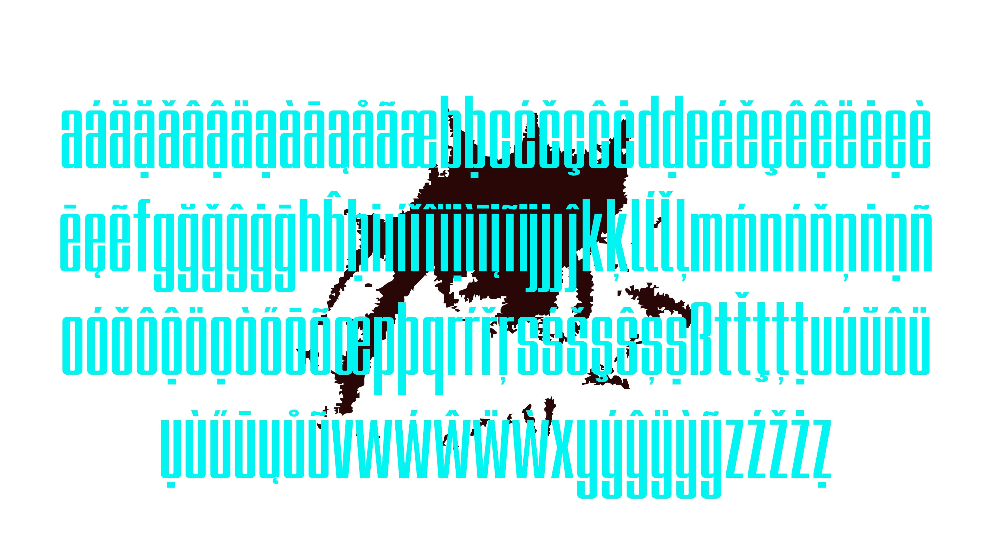
Oscar Display is a variable display sans serif in the geometric grotesk tradition, constructed on a square geometry with rounded corners to balance structural precision and visual movement. The system spans nine weights from thin to black and operates across a dynamic width range, shifting between condensed and extended proportions. It also transitions between upright, italic at seventeen degrees, and slanted at thirty four degrees.

Initial inspiration comes from the 1954 Schmalfette Grotesk by Walter F. Haettenschweiler, particularly in its condensed proportions and strong typographic presence. This reference informed the early formal direction of the project, introducing a broader range of widths and orientations while maintaining a consistent geometric logic.

Type design

Image 2
Image 5
Image 8
Image 9
Image 10
Image 11

Kinesis is an editorial series dedicated to kinetic art, an artistic movement centered on real or perceived movement through technologies, innovative materials, and optical illusions. The magazine explores artists, works, and techniques that have shaped and transformed this language, connecting historical and contemporary experiences of movement based art. These include figures and projects such as Jean Tinguely, Yaacov Agam, Umberto Ciceri, Cybernetic Serendipity, and more recent practices related to digital and interactive art.

Historically magazines represented one of the fastest media for spreading artistic and cultural content. With the transformation of digital media their role has gradually shifted toward a slower, reflective, and archival function. In this context Kinesis aims to build a dedicated archive for kinetic art, collecting and documenting works, artists, technologies, and research that still lack a systematic editorial reference.

Editorial design

Creative direction

Visual identity

Design Spaziale Italiano is a travelling multimedia project curated by Annalisa Dominoni and Benedetto Quaquaro and promoted by the Italian Ministry of Foreign Affairs and International Cooperation. The initiative highlights the strategic relevance of design for space exploration, a field in which Italy plays a leading role and where Politecnico di Milano has contributed since 1997 to its development and dissemination. Through a series of visual narratives and multimedia artefacts, the project reflects on the physical and perceptual limits of human presence and movement within the extreme conditions of life beyond Earth.

The project required the design and development of the digital interface supporting the multimedia experience. The work focused on UI and UX design and on the complete front end implementation developed directly in code using Astro.build. Particular attention was dedicated to structuring the interaction logic, integrating video based narratives, and ensuring responsive behaviour and performance across devices while maintaining coherence with the conceptual and visual framework of the exhibition.

Brand strategy

Visual identity

Creative direction

UI/UX design

Front-end development

Motion design

Image 2
Image 5
Image 7
Image 10
Image 12
Image 13
Image 15
Image 16
Image 18
Image 20
Image 21

The Passenger is a book magazine series published by Iperborea that investigates the contemporary condition of specific places through long form journalism, essays, and narrative reporting. Each volume brings together writers, journalists, and specialists from both local and international contexts to examine cultural life, economic structures, political dynamics, and everyday practices. A system of infographics, data visualisations, and cartographic narratives developed by Tomo Tomo studio and later continued at Propp translates research data and geographic information into clear visual structures that support the editorial narrative and provide readers with a layered understanding of each place.

The work focused on the design and development of cartographic visualisations for the volumes dedicated to the Alps and London. Through a rigorous process of data collection, spatial analysis, and editorial simplification, the maps were structured to transform complex geographic and cultural information into precise and legible visual systems aligned with the editorial language of the publication.

Graphic design

Information design

Map design

Editorial design

Image 6
Image 7
Image 8
Image 9
Image 10
Image 11
Image 12

The project focuses on the redesign of the wayfinding system for the emergency department of the Lodi hospital in Italy. The intervention was developed to improve orientation within a complex environment characterized by tight and non linear paths. The new signage system introduces a clear structure based on sectors, combining wall signage and floor markings to guide patients, visitors, and medical staff through the space in a more intuitive and functional way.

The project was developed at Studio 100km with contributions under the supervision of Luigi Farrauto, founder of the studio. The work involved supporting the development of the wayfinding system with particular attention to visual clarity, icon design, and the definition of the graphic language of the signage.

Graphic design

Information design

Wayfinding

Map design

Icon design

By.it is a speculative project presented as an e commerce website offering products at extremely discounted prices. During the day the items consistently appear as unavailable and the platform invites users to return at night, suggesting they save a reminder in their calendar. When accessed during nighttime the website radically changes its appearance and becomes KilledBy.it, revealing that many of those products have in reality caused severe harm and, in some cases, even death.

The project integrates concept development, website design, and visual production to construct a coherent narrative system. Visual identity, three dimensional product models, and the digital interface were designed to support this storyline, adopting a direct and brutal visual language that reinforces the tension between commercial attraction and the real consequences associated with the products.

Visual identity

Graphic design

UI/UX design

Front-end development

Motion design

3D design

Team

Giulia Cangini

Arianna Cecchet

Elisa Corbetta Simone Iasevoli

Sara Ibarra

Andrea Piersimoni

Antidisciplinary Lab is the final synthesis studio of the Bachelor program in Communication Design at the School of Design of Politecnico di Milano. Within this context Raw Scenarios was developed as both an exhibition and an archive of projects exploring food through speculative design. The initiative presents eleven communication design projects that use interactive devices and communicative machines to construct critical scenarios about the future of food production and overconsumption, encouraging reflection on the environmental, social, and economic impact of contemporary eating habits.

Within the project presented in the exhibition, the contribution focuses on user interface and user experience design together with the front end development of the digital system. The work includes the definition of interaction flows, the design of interface screens, and the implementation of the digital interface for the interactive prototype exhibited.

Visual identity

Graphic design

UI/UX design

Front-end development

Creative Coding

Team

Caterina di Noia

Image 4
Image 5
Image 7
Image 9
Image 10
Image 12
Image 14
Image 15
Image 17
Image 23
Image 25

Neptuna is a speculative design project exploring the relationship between climate change, food production, and contemporary consumption through the emblematic case of tuna. The project imagines a scenario set in 2050 where accelerated social and production rhythms lead to increasingly fast and standardized food consumption. Tuna is reinterpreted as an ultra fast snack capable of replacing traditional meals, pushing on the go consumption logic to its extreme. Through a provocative language combining irony and disgust, the project uses speculative design and dark design to expose the environmental and cultural consequences of marine resource exploitation, microplastic pollution, and methylmercury contamination in ocean ecosystems.

The project was developed through a multidisciplinary approach integrating research, strategy, and design. The team worked on data analysis, speculative scenario building, visual identity and brand system development, product and packaging design, photographic communication and video campaigns, as well as user experience and digital touchpoint design. Three dimensional models of the products and packaging system were developed together with a custom logotype and a coherent communication ecosystem connecting product, identity, and narrative. The project also includes the design and construction of a fully functioning physical prototype, an interactive vending machine built and programmed by the team using Arduino for the hardware and p5.js for the digital logic and interface.

Speculative design

Visual identity

Creative direction

Graphic design

UI/UX design

Front-end development

Type design

Motion design

Creative coding

Video making

Packaging design

3D design

Icon design

The “Saper fare liutaio di Cremona” project addresses the cultural value of Cremonese violin making, a craft recognized by UNESCO as Intangible Cultural Heritage of Humanity. This tradition, rooted in the sixteenth century and still practiced by more than one hundred luthiers, represents a unique intersection of craftsmanship, music, and cultural history. The project explores how a visual identity can communicate the depth of this heritage by translating the knowledge, precision, and musical culture embedded in the making of violins into a contemporary communication system. 

The project develops a complete redesign of the visual identity and its applications. The system includes the design of a new logo, typography, editorial and informational materials, signage for the city, digital tools, and communication artifacts that connect workshops, museums, and cultural institutions. Together these elements form a coherent visual framework that presents the craft of Cremonese violin making as both a living tradition and a contemporary cultural asset.

Brand strategy

Visual identity

Creative direction

Graphic design

Map design

Motion design

Video making

Image 1
Image 2
Image 3
Image 8
Image 9
Image 10
Image 11
Image 12

The Milan Metro Map is conceived as a hybrid cartographic system combining geographical accuracy and schematic representation. At its center, a circular area preserves the real geographic structure of the city, highlighting the metro network together with Milan’s principal roads, landmarks, and urban references. Beyond this central area, the map transitions into a conceptual diagram that represents the complete network of metro lines and suburban railways, including the broader metropolitan zones. The project also integrates a narrative layer describing the historical evolution of Milan’s defensive walls, whose Spanish fortifications form a heart shaped trace within the urban fabric, linking cartography with the city’s historical identity. 

The project was developed within 100km studio under the guidance of Luigi Farrauto. The work contributed to the development of the cartographic system and visual structure of the map, balancing geographic precision with schematic clarity while integrating transport networks, urban landmarks, and historical references into a coherent visual framework.

Information design

Wayfinding

Map design

Image 2
Image 3

Rappresentazione dell’assenza e dell’essenza del nero is a visual essay that investigates the nature of black through both scientific and cultural perspectives. The project examines the physical composition of black and the many ways it can be represented, gradually shifting from analytical observation toward its emotional and symbolic presence in artistic practice. Through references to art history, philosophy, and perception, the work invites the reader to reflect on black as both absence and essence, a condition that oscillates between material reality and introspective experience. 

The editorial project was developed through a structured typographic and layout system designed to support the conceptual narrative of the publication. Careful attention was dedicated to hierarchy, rhythm, and the relationship between text, images, and negative space, creating a visual sequence that guides the reader through analytical sections and reflective moments while maintaining clarity and coherence across the publication.

Visual identity

Creative direction

Graphic design

Editorial design

©2026 Matteo Postinghel
All rights reserved
Cookies
This website uses cookies and similar technologies to ensure proper functionality, analyze traffic, and improve your experience. By continuing to browse, you consent to the use of these technologies. You can manage your preferences or withdraw your consent at any time through your browser settings.